Day 2: Notes on design process
Regardless of whether I’m making a painting, a comic, or a web app, I’ve always fluidly moved between designing on paper, in design software, and on the fly as I’m making the final product. Each type of design has its place, and the same has been true so far with the game.
During the last few months though, I almost exclusively worked on the game in a sketchbook. I already had a basic game prototype, but I didn’t know where I wanted to take it, so I started writing and drawing every morning.
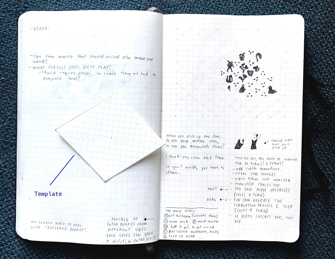
Most pages have a few notes, a few loose drawings, and maybe a level-mock up. Since the game board is isometric, I overlay another grid on top of the grid in the sketchbook whenever I need to mock-up levels. I cut out a template to make the process easier. Here’s an example of a sketchbook page with the level template:

Why work analog when I could make digital mock-ups much more quickly?
I want my background in drawing to be a driving force in the game. I plan to hand-illustrate all the artwork in the final game, so visual development needs to happen on paper. There’s no copy + paste on paper, so every time I re-draw a character or a symbol, I get to know it better and can improve it.
I enter a different state of mind when I work on paper. It’s partly subconscious: sketchbooks look and feel like diaries, while design tools look and feel like work. Intimacy is also inherent to the medium: the feel of pencil to paper and the distinction of my handwriting and mark making put me in a certain mode of thinking. As a result, I tend to produce ideas and images that are more idiosyncratic. Paper is slower, but leads to unexpected places.
Designing on paper isn’t a replacement for designing with software. They’re two different kinds of work. I’ve always done both.
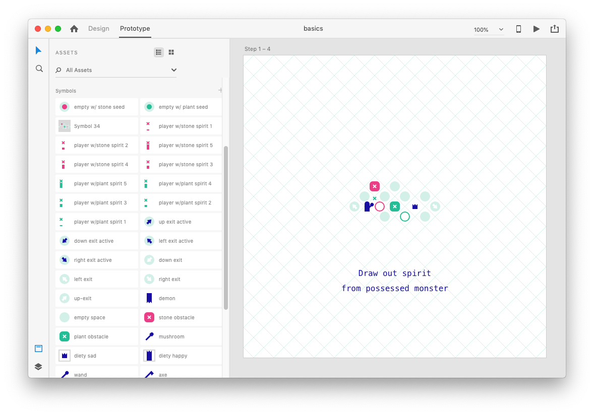
I moved beyond pencil and paper today, and switched over to Adobe XD. I like XD because it’s simple and it has a built-in prototyping UI. Using my sketchbooks as a reference, I mocked up a player flow for a basic level. XD let me pull together promising game mechanics from my sketchbook into something cohesive:
I took exactly the same approach to designing this level that I would take when designing a user flow in a web app. I found it super helpful for clarifying some of the ideas I’ve been experimenting with, and I now feel ready to implement some of these ideas in code.
Since I plan to come back to this sketch frequently, I set up an Adobe XD file with symbols. Now I can drag and drop the pieces I need to mock-up a board. Each symbol represents a different type of object in the game:

Moving forward, I’ll use my sketchbook for exploring new ideas and for visual development, and Adobe XD for mocking up interactions and full levels. As a UI designer by trade, I’m tempted to build a dedicated level editor that could replace XD, but I’m not sure that would be the best use of my time.